Coverly
Disrupting the small business insurance market with a new digital experience.
Disrupting the small business insurance market with a new digital experience.
Lead Designer
Lead Designer
5months
5months
Sketch, Invision, Adobe Creative
Sketch, Invision, Adobe Creative
Branding, Responsive design and Interaction design
Branding, Responsive design and Interaction design
A new digital-first insurance service aimed at small business owners looking for more freedom, support, and flexibility from their business insurers.
Design. Test. Iterate
We ran a kick-off workshop with the client to help gather valuable insights, this included defining:
- Who is their target audience?
- What’s their brand?
- What's the brand promise?
- Defining a Value Proposition
Fujifilm XT2 and Adobe After Effects.
This video was captured and made by me using my Fujifilm XT2 and Adobe After Effects.
Physical to Digital
We landed on 3 territories for the brand using the workshop outputs from the previous week. We co-created the physical moodboard with the client which acted as a great guide to digitise them allowing us to add motion to further our search for the brand direction. These 3 mood boards were:
- Simple, bright and breezy experience
- Quietly clever flexible insurance
- A smooth customer experience that takes the hassle out of insurance
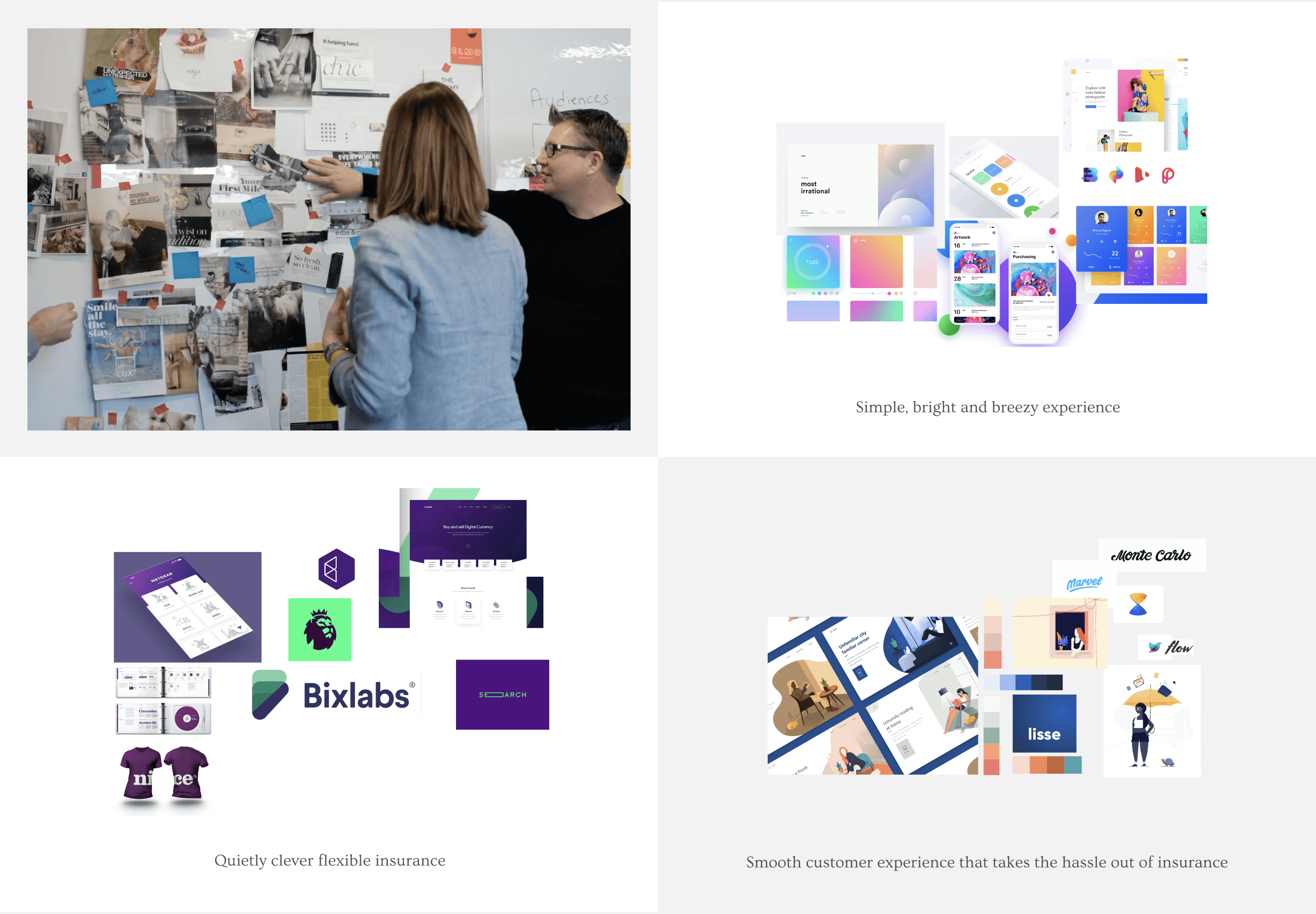
Mood boards
Digital mood boards
A/B Testing 1, 2, 3
We designed a mixture of landing page concepts using the moodboards we created with the client.
We used the companies’ business proposition as the core messaging.
To speed up this process I used existing visual stimuli from the internet to mock up a higher fidelity visual direction without spending too much time worrying about the details. This was super helpful to make the designs feel more real and allow our client to get a better understanding of a visual direction too.
We used a dot-voting technique to highlight our personal preferences and then discussed how we wanted the project to move forward. This was a quick way to get sign-off on a direction and worked really well for client engagement.
We designed a mixture of landing page concepts using the moodboards we created with the client and with the companies’ business proposition as the core. To speed up this process I used existing visual stimulus from the internet to mockup a higher fidelity visual direction without spending too much time worrying about the details. We used a dot-voting technique to highlight personal preferences and discuss how we wanted the project to move forward. This was a quick way to get sign off on a direction and worked really well for client engagement.
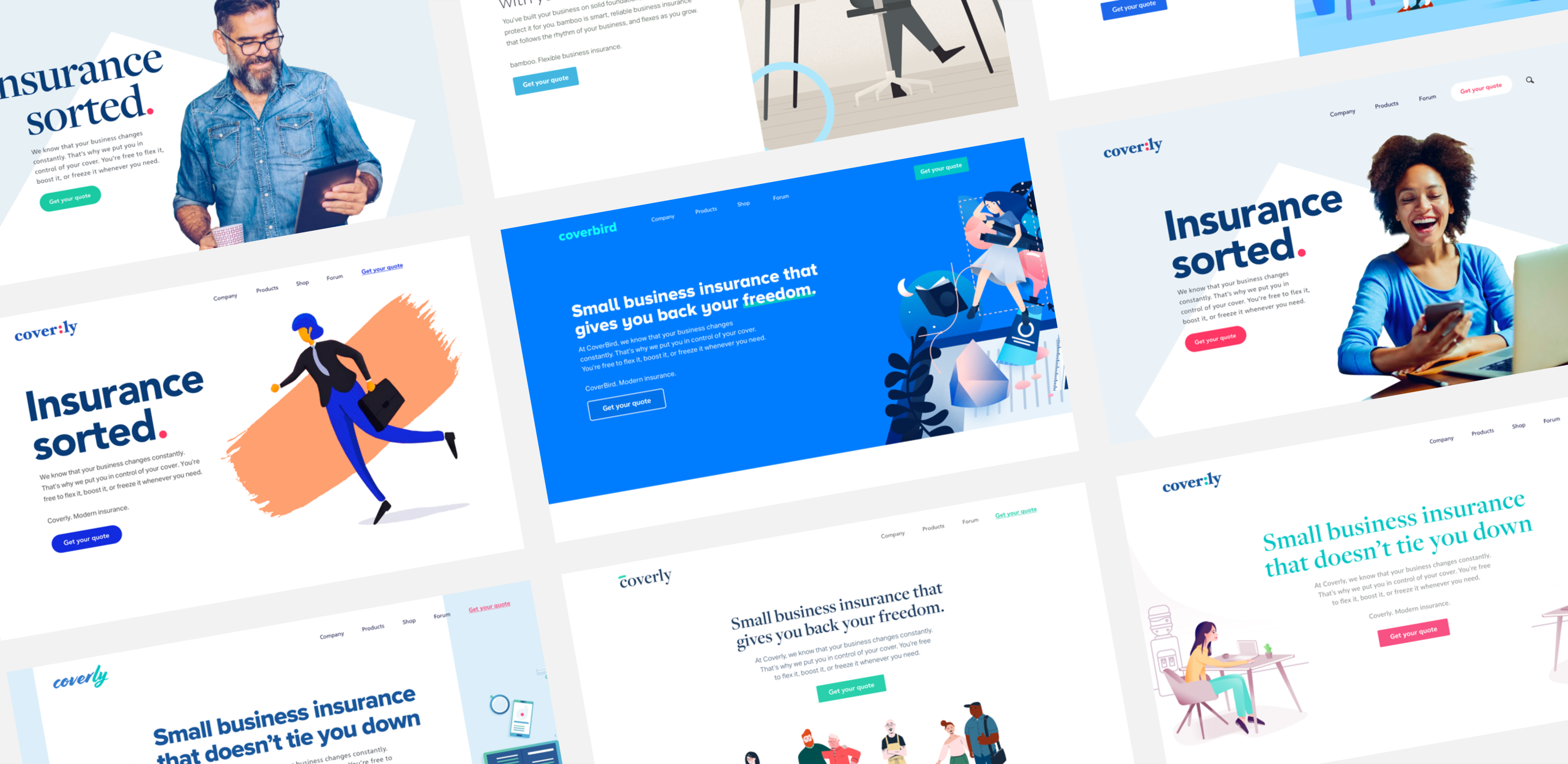
Multiple design concept directions
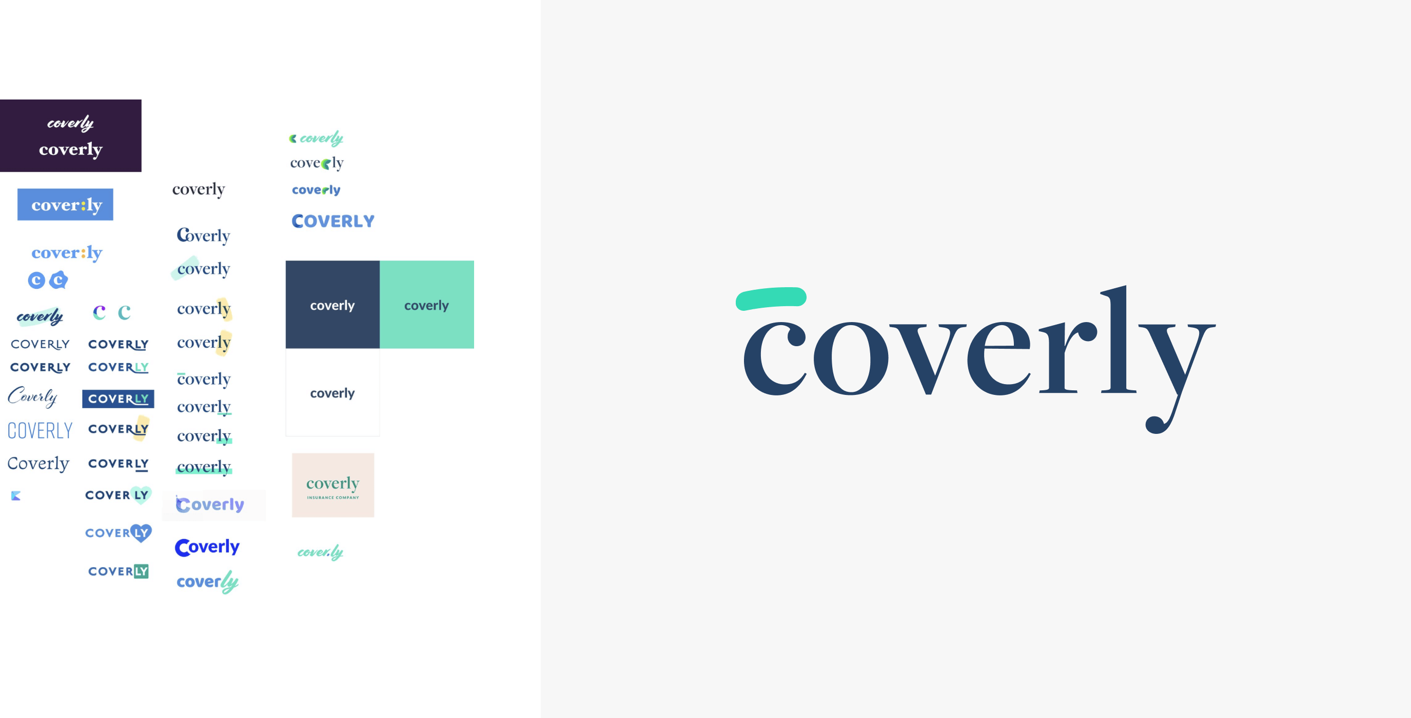
Brand look and feel
The brand needs to:
- Feel clean
- Modern
- Evoke trust
- Be likeable but steer away from traditional insurance providers.
The navy colour evokes trust and the teal colour made for a great complimentary colour that would be used for the call to action throughout the site.
The curve above the ‘C’ was created as a nod to the user that you are ‘covered’ and we will have you covered. This curve is used for the website favicon, social media profile pictures and would be used as a brand identifier and differentiator.
Testing the Value Proposition
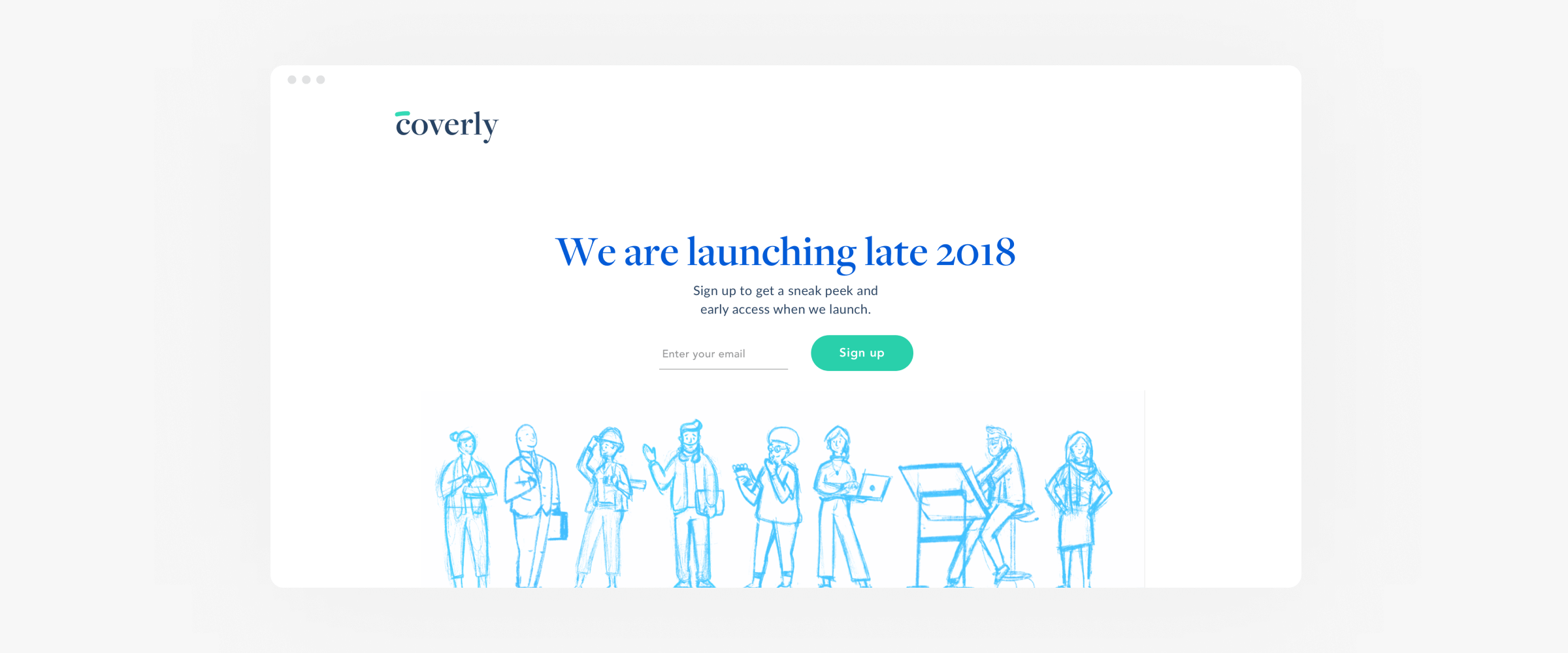
Now that we had an awesome visual direction it was time to test out the value proposition that we had co-created with the client. We rapidly designed and built a landing page to capture the initial interest of the service.
We were able to publish multiple variations of the value proposition to really understand what was working best for selling the idea for this service which meant we could back our decision by data.
We used Facebook Ad campaigns to get traffic to the site and we used Unbounce to build and host the landing pages.
Journey and Flow
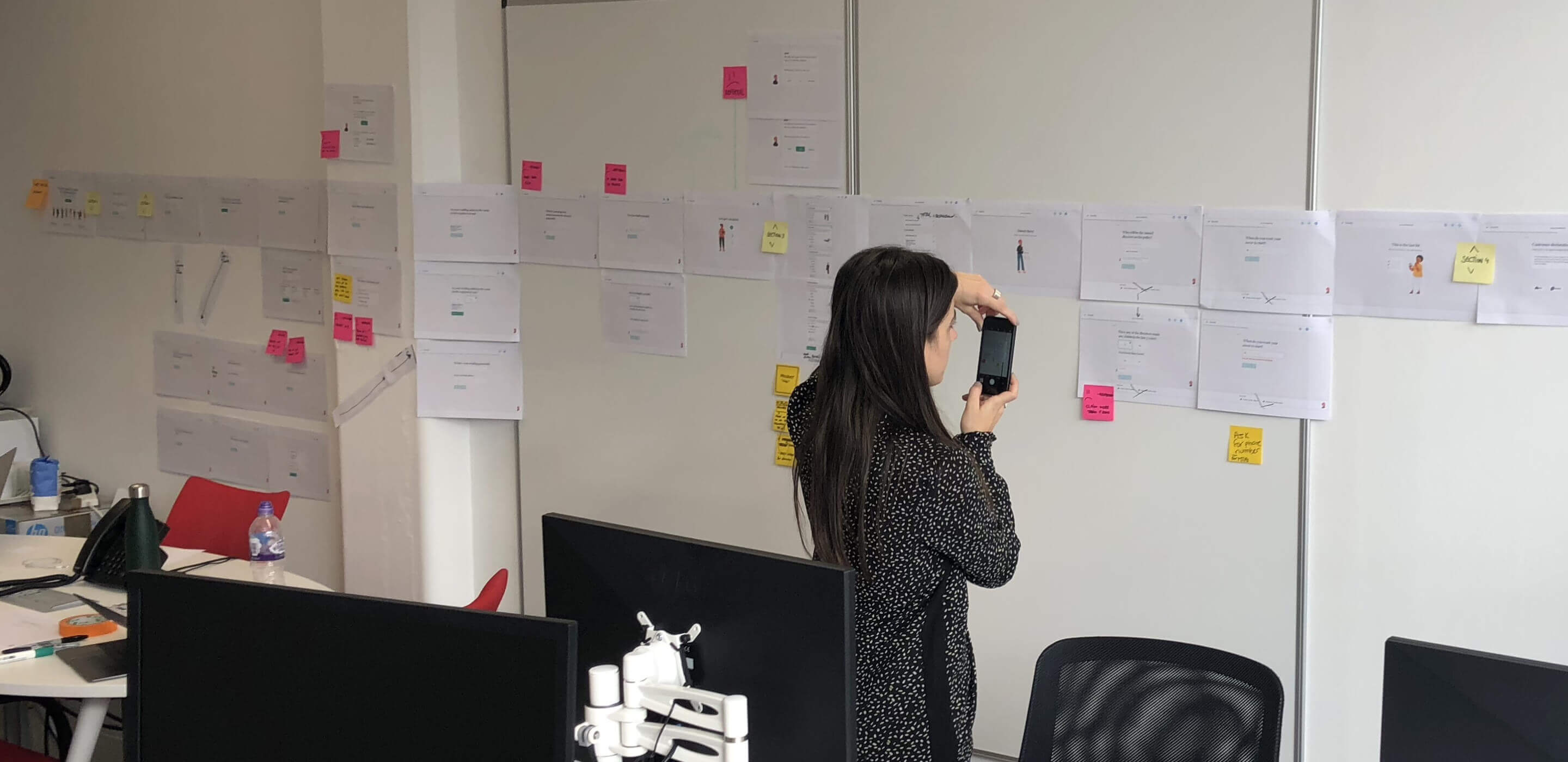
The client and insurance provider had a specific set of questions that were required to be asked during the quote journey. This was in order for the product to meet the requirements of the provider. To do this we decided to map all of these questions into a wireframe flow, we printed this out and stuck it up on the client's office wall. Doing it this way allowed us to work closely with the client, control the outcome and finish the day with an agreed user journey from all parties.
Interaction prototypes
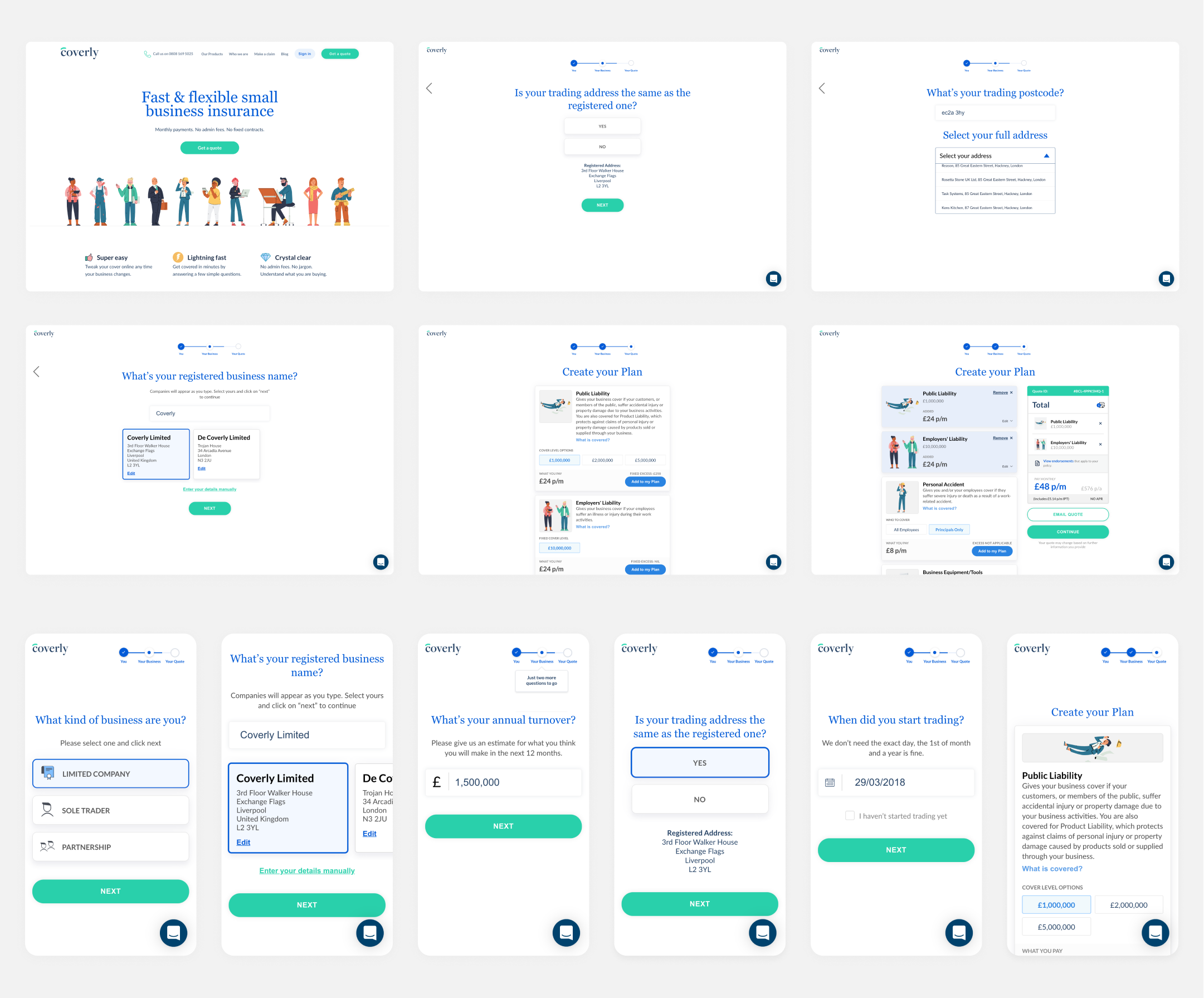
Prototypes were a great way for me to test user interaction, get client approval and give the developer a great point of reference.
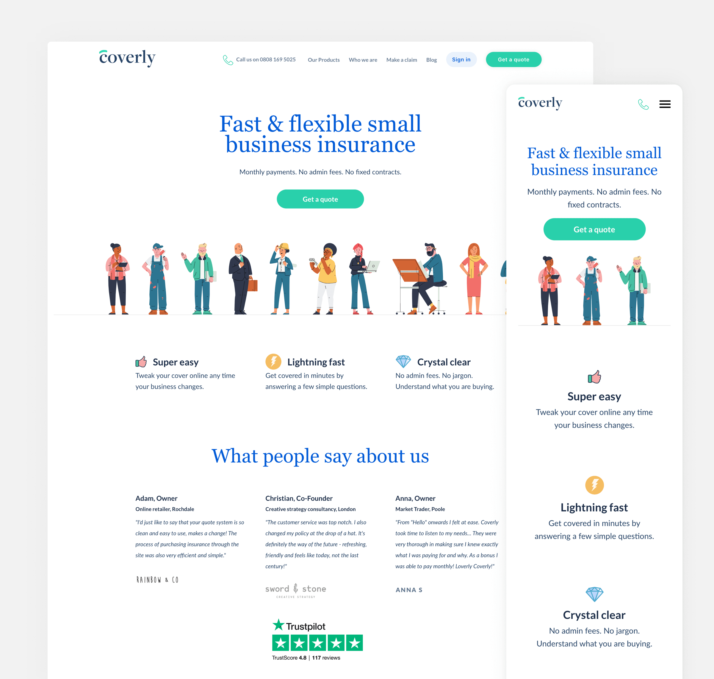
Final Output

© Todd Richardson 2022
© Todd Richardson 2022
© Todd Richardson 2022